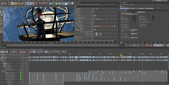
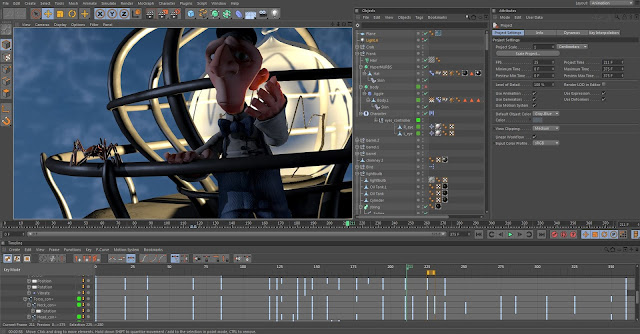
It can be a bit tricky to animate someone not doing anything. How do you animate something that is just standing still. Well, mostly.
I wanted Frank to stand close enough to the lighthouse to be able to kick the building to fix the flickering light. But the scene did not look very good with Frank in that strange position so he had to stand more toward the centre. The light then just flickers a bit and goes back on. No worries.
The crab is in the scene as well... doing almost nothing.
Simon Jannerland studies
lördag 5 maj 2012
Next up...
... the light bulb changing scene.
The neighbour fall scene is pretty much done so I'm moving on to the next one.
This scene had some of the same problems as the forst one. Getting the crab to sit right on the rail was not a game but it will have to do.
I added a bit of violence by letting frank hit his head against the cage as he rises after fixing the light. It just fit the scene so well.
This is just a very draft render but I still enjoy the effect of the sss in his skin. Makes such a huge difference! Mmm glowy ears, so good.
Neighbour fall scene
After moving our life from one place to another and getting everything set up I'm finally back in the chair and getting on with the animation bits.
Starting of with the "neighbour fall" scene. Realizing animation is nothing easily stressed. Not if you want some sort of quality anyway. It takes some time. I would have loved to do some pencil tests to try out the animation before getting into 3D but there might not be time for that so ill just cross my fingers and go 3D.
Also realizing some difficulties in mimicking a very loose storyboard. Some things does not work as well in 3D as in 2D. Like putting the crab on top of the wooden pole. Did't look good at all. So I did a barrel and placed him on that one instead. You gotta have some barrels if you're living on a dessert island right?
First 2D animation
Did the first bit of the 2D animation. You really feel powerful when doing traditional 2D animation after building 3D stuff for a couple of years. All of a sudden you can just get right into animating. No setting up, no restrictions no fuzz. Feels good for a change!
All in all I'm pleased with the animation. Needs more contrast to make Frank pop from the scene a bit though.
View it in HD!
setting up
Here's some more test renders. This time seeing Mr Frank himself amidst the archipelago wasteland. All is set up for animation to commence!
fredag 24 februari 2012
The scene is getting set up
So here's a more finished render of the island. Still some minor things to work put. But it is really getting the feel. Since last I have added doors and some grass. Also did a displacement for the sand. Metal material for the lighthouse. I want to sell the feeling of him actually living there. So there might be some more details later on. I added the stepping stones that helped give it some sense of home.
Week 8
This week was all about getting the scene set up, textured and get the final look and feel. After the slower production last week and falling behind a bit it's nice to be able to catch up a bit. I had a rough block of the environment since a few weeks back. I started adding to it
I added a house simple house and had the abition of opening this up in Zbrush and painting it it. I spent way too much time trying to get this to work. At the end I did not use this metchod. I learned a lot about Both Zbrush and some about workflow but didn't get the house done.
I continued working on the bridge instead. Blocks and cylinders. The Magnet tool turned out to be a good friend in the speedy modeling state.
After wasting soo much time trying to UV map and sculpt in Zbrush I just wanted to get some stuff done. I UV-mapped these planks in C4D and did the textures in Corel. I used CrazyBump to get some Normals from the textures. I worked out great and I saw how well a Normal map and simple geometry sells the isuals. I did the clamshell as well.
The scene started to get some life with the characters and I started to get fun again.
I liked the look and the simplicity of the planks so I decided to make a couple of extra planks and build the the house with the. Just use the base mesh as a foundation to escape see through bits. I added texture to the lighthouse as well.
The place needed some life. I added some leafs and gave them a basic green. It looked to healthy and fresh at the moment so I needed to make it look older and more dry.
I gave the cabbin some color and tweaked the colors to feel a bit more worn out. Leafs got mor dry and yellow as well. Made a huge difference.
Finally dared to head back into Zbrush. This time doing the rocks. It worked out like a bliss. The rocks might be to "sandy" in the color. But the textures worked out good.
Additional target:
Having the CV done within two weeks.
Prenumerera på:
Kommentarer (Atom)


